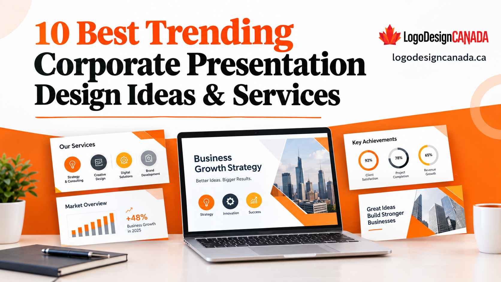
10 Best Trending Corporate Presentation Design Ideas & Services
You can add brilliant information in a corporate presentation and still fall flat. This often happens when the slides lead the audience to work too hard. If your presentation contains dense paragraphs, weak visuals, predictable layouts, and charts that require a decoder ring, it can turn an important business message into background noise. This approach is becoming harder to justify in 2026. The latest visual communication research from Canva found that 84% of professionals say poor visual communication can cause delays and confusion, and creative visual content can produce 74% faster memory recall than dull alternatives.
The answer is not just to simply add more graphics in your presentation. It is about designing slides around the way that people actually consume information. In this blog, here are 10 corporate presentation ideas and service approaches that are worth considering now, along with practical steps to turn a basic deck into something persuasive, polished and memorable.
Top Presentation Ideas And Services
Minimalist And Message-First Slides
Minimalism is not just about making a presentation look like an empty slide. It is about removing anything that is competing with the main idea. If you are making a strong corporate slide, it should make its purpose obvious within seconds. You should identify the one point that your audience needs to remember and build the slide around it instead of placing six statistics, three paragraphs and a chart on one screen.
This direction can also reflect a wider movement toward simplified data visualization. Current presentation-design discussions are increasingly favouring one meaningful insight per slide instead of crowded dashboards.
Full-Bleed Photography
The use of generic stock photography is losing its grip on corporate presentation design. You can use full-bleed photography as it can give a presentation an editorial feel, especially when the image has a genuine connection to the company’s customers, product, workplace or market.
For example, a technology company might use an authentic image of its product that is being used in context instead of another predictable photograph of people shaking hands. The trick is restraint. You should let the photograph carry the emotion, then place concise copy over a carefully chosen area with sufficient contrast.
Dark Mode And High-Contrast Themes
The use of dark presentation themes can make corporate decks feel sharper, particularly for technology, automotive, finance and innovation-focused brands. You can pair a charcoal or deep navy background with restrained accent colours that can create a strong visual hierarchy.
Features like the right charts and highlighted figures can also become easier to notice, but dark mode should never sacrifice readability for style. Accessibility is crucial here. Microsoft recommends checking contrast through the use of appropriate fonts and layouts, adding alternative text to visuals and testing presentations with accessibility tools.
Asymmetrical Editorial Layouts
Perfectly centred slides have their own place, but modern corporate presentations are becoming more comfortable with asymmetry. You can imagine a slide that is split into two uneven sections: a large statement that occupies roughly two-thirds of the canvas with a small chart or supporting image to sit in the remaining space.
The imbalance of the design can create movement and still maintain structure. This can work particularly well for strategy decks, investor presentations, annual reports and brand stories, as it gives the designer more freedom to establish visual priority instead of treating every element equally.
Data Storytelling Instead Of Data Dumping
Numbers can become persuasive when people understand why they are important for the presentation. Instead of showing a complicated spreadsheet-style chart, you should turn the data into a short visual argument. You can now begin with the conclusion, show the evidence, then explain the business implication.
For example, a sales presentation may headline a 28% increase in customer retention, visualize the trend and then connect it directly to the proposed solution. This approach is increasingly important as businesses become more visually oriented. Canva research of 2024 found that 90% of surveyed sales leaders said that visual collateral accelerated sales cycles.
Custom Icons And Illustration Systems
You can use custom visuals to make an otherwise ordinary corporate deck feel unmistakably branded. Instead of mixing icons downloaded from different libraries, you should create a consistent visual language. The same stroke weight, proportions, corner treatment, and colour logic should carry throughout the presentation.
Use illustrations that can also explain complicated processes without forcing the audience through blocks of text. This is where an experienced graphic design firm will support you in being valuable. A professional team will guide you and help you develop a reusable visual system instead of decorating individual slides one at a time.
Interactive And Modular Presentations
Every presentation does not need to follow a rigid slide-one-to-slide-twenty sequence. The features, including interactive navigation, clickable diagrams, section menus, progressive reveals, and modular content, can help make presentations more useful for sales meetings, training, workshops and executive briefings.
For example, a salesperson may jump directly from a company overview to pricing, implementation or a case study that depends on the client’s question. The result will feel less like a slideshow and more like a conversation.
AI-Assisted Visual Workflows
AI is becoming a part of the presentation process, but it works best as an accelerator instead of a replacement for judgment. Teams can use AI to explore layouts, generate initial visual concepts, summarize source material, or speed up repetitive production tasks. The final deck will still require human editing for accuracy, tone, brand consistency and strategic clarity.
Kinetic Typography And Controlled Motion
Animation can help you make a presentation more engaging when it supports the story. A headline that appears before it supports statistics can control attention. A process diagram that can be built step by step can make a complicated workflow easier to follow. Subtle movement between these sections can also create continuity.
The danger is obvious: too much motion can become distracting. Corporate audiences often do not need spinning logos, bouncing text or elaborate transitions. Motion should answer a question: What does this corporate animation help the audience understand?
Branded Presentation Systems
The most useful presentation services in Canada are not necessarily about the one that can produce a beautiful deck once. It is ideal to choose a stronger approach to create a presentation system that contains master layouts, colour specifications, icon treatments, typography rules, chart styles, image guidance and reusable slide structures. Marketing and sales teams can then build future presentations without the need to reinvent the visual language every time.
Frequently Asked Questions
What things can make a corporate presentation look professional?
A professional presentation can help you combine consistent branding, clean spacing, accurate data, strong typography, meaningful visuals and a logical story. It should also feel appropriate for its audience and purpose. A polished appearance is also crucial, but clarity and relevance will ultimately determine whether the presentation works.
How many slides should I include in a business presentation?
There is no universal fixed number of slides for a business presentation. A short sales meeting may require 8–12 focused slides, and an annual business review may need considerably more. You should give each slide a clear purpose and remove anything that does not help the audience understand or act on the message, instead of targeting a specific count.
What should I provide to a presentation designer?
You need to give the designer the presentation objective, source content, existing assets, target audience, brand guidelines, required format, deadline, and presentation setting. If there are examples of styles that you like, then you should share those too. Clarify your presentation context at the beginning; this usually reduces revisions and produces a stronger final deck.
Final Thoughts
Corporate presentation design has moved well beyond attractive templates and decorative graphics. You need to make the strongest decks that simplify complex information, use purposeful visuals, establish clear hierarchy and respect the audience’s attention. Minimal layouts, custom visuals, accessibility, meaningful data stories, thoughtful motion and reusable brand systems are shaping modern presentation work. The real goal is simple: you should make important information easier to understand and harder to forget.

I manage the content for LogoDesignCanada.ca, where I explore the intersection of branding, design, and business growth. My posts focus on everything related to designing including logo creation, website designing, banner designing, ecommerce web design and many more. Also sharing important insights on effective UI/UX, responsive layouts, and visual storytelling. I help businesses to understand how a strong brand identity and a well-designed online presence can boost visibility, customer engagement, and long-term success.