10 Best Logo Design Tips to Boost Your Brand Presence

A logo isn’t just a symbol with beautiful colours, but it’s your brand spotlight. Within a split second, it can tell people what your business is about, your values, and why they should care about knowing them further. As your logo is the face of your brand, it should say a thousand words before reading a single one. So, skipping it is the last thing you’d want to do.
But designing a logo demands more than just a good artist. You need to be aware of the trends that not only help you create a pretty logo but also boost your brand presence.
Thankfully, you’re reading a blog that sheds light on insights and tips for getting a catchy logo.
By the end of it, we are sure you’ll know everything about logo design that helps you ace your brand presence.
The Secret Behind a Memorable Logo
A well-designed logo can communicate your brand personality instantly. When it comes to design, it’s not about adding more elements but capturing the essence of the brand in a very recognisable manner.
To create it, you don’t need professional logo design services, because this blog covers every little secret. Let’s explore the 10 practical topics to help you create a logo that truly stands out.
1. Simplicity Wins Every Time
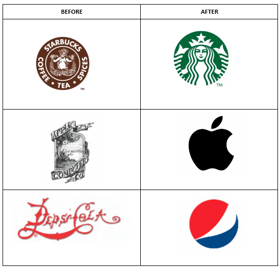
Never underestimate the power of simplicity. A simple logo can be super recognisable and easy to remember. We suggest you avoid complex shapes, too many colours, and elements that can distract your audience.
You would want your brand logo to communicate your values at a glance. So, keep a professional approach to design that can make your logo versatile for any packaging.
Some Famous Brands That Rebranded to Simpler Logos

2. Design with Audience in Mind
Your logo should instantly click with the audience you want to reach. So, it’s always better to consider your audience’s age, preferences, and values before choosing the design.
Why do that? Because you want to create a logo that not only connects to your audience but also builds trust and loyalty.
3. Pick Colours With Purpose
Colour can be a true game-changer! Imagine the Apple logo in a bright red or orange colour; it definitely doesn’t align with their audience. That’s why choosing the right colours is so important.
Because colours communicate emotion and have the power to influence, pick a palette considering your purpose. Avoid shades that clash together or may turn down our logo’s personality.
Behind every colour is a meaning. Explore the table to understand how colour influences perception.
Colour Psychology Table
| Colour | Emotion / Meaning | Example Brand |
| Red | Energy, Excitement | Coca-Cola |
| Blue | Trust, Reliability | |
| Green | Growth, Health | Whole Foods |
| Yellow | Optimism, Happiness | McDonald’s |
4. Use Clean and Readable Fonts
Typography is another factor that contributes to a great logo and, eventually, a solid brand presence. Always choose fonts that appear clear in different sizes and mediums. Avoid fonts that are too bold, curved, and stylised because they are quite difficult to read.
While merging two fonts, the combination has to be seamless. Clear fonts that balance professionalism and creativity are the best way to go!
5. Prioritise Scalable Design
Design with a bigger picture in mind. This means your logo has to look stunning everywhere it is placed. Whether it’s a tiny icon or a large billboard, it should be scalable and crisp in every scenario.
It is suggested to go for vector-based designs because they sustain quality at every size. Last but not least, it improves consistency, and that’s all we’re looking for.
6. Design Logos That Work in Colour
Colours play an important part, but design a logo that looks incredible independently. This means it should appear outstanding with both black and white and colours, but shouldn’t just fall flat without one.
Curious, why is it important? Because it should complement every format. From websites and social media to marketing collateral and merchandise, a good logo works everywhere.
Take a design-first approach and create something that stays memorable regardless of where you use it.
7. Avoid Trends That Fade
One bad thing about trends is that they come and go quickly. That’s why you should always aim for a timeless design that stays memorable forever. Stick to classic shapes, fonts, and concepts so your logo can look familiar even after many decades.
Avoid complicated designs, patterns, or mascots that may stay relevant just for this year. When you hire a graphic design firm, they go for a classic look, so you don’t need frequent redesigns over the year.
8. Use Symbols That Add Meaning
Adding a symbol or icon to any logo can instantly elevate its look. Beyond aesthetics, it will communicate your message and values within just a single glance.
For instance, a leaf shows growth and sustainability.
But take care of one thing: symbols should be simple and versatile. If it overshadows your brand name, you’re on the wrong route. So, pick the one that complements.
9. Create Multiple Logo Variations
Having a single logo might not do the job well. You need to have some variation in the horizontal, vertical, and icon-only versions so it sustains the same essence without losing consistency.
Once you have multiple variations, your brand will be highly recognisable across various formats.
Logo Variations for Every Platform
| Logo Type | Use Case |
| Full Logo | Website header, packaging |
| Icon / Symbol | App icon, social media profile |
| Wordmark | Letterheads, signage |
| Black & White | Print materials, stamps |
10. Design for Future Growth
A logo is an investment in your future brand, so design it wisely, keeping in mind that your product or service range may evolve over time. Use simple elements, so the design looks adaptable as the business scales over time.
A great logo design also stays relevant when you expand to a new market or geographical location. So, plan ahead and ensure your logo has elements that are neutral, relevant, and recognisable.
Wrapping Up
By now, we all know that a strong logo serves more than just great looks. It tells your brand story and connects with your audience. By focusing on simplicity, versatility, a futuristic approach, and more, you can create a logo that keeps your brand alive forever.
Whether you’re designing yourself or relying on a professional, the above tips will help you build a logo that sets you out in the crowd.
I manage the content for LogoDesignCanada.ca, where I explore the intersection of branding, design, and business growth. My posts focus on everything related to designing including logo creation, website designing, banner designing, ecommerce web design and many more. Also sharing important insights on effective UI/UX, responsive layouts, and visual storytelling. I help businesses to understand how a strong brand identity and a well-designed online presence can boost visibility, customer engagement, and long-term success.